Chapter 5: Ta panda rhei#
Generation of animations and interactive plots.#
Earth is a dynamic system with changes occuring at any instance. Why not using the same philosophy when we create plots about our environment?
In this tutorial we will:
Search, download, and view data freely available in Climate Data Store.
Use country shapefiles for generating country-average fields.
Create dynamic outputs in the form of animations and interactive plots.
| Run the tutorial via free cloud platforms: |
|
 |
|
|---|
Section 1. Install & import the necessary packages.#
The first step for being able to analyse and plot the data is to download and import the necessary libraries for this tutorial. We categorized the libraries based on that they are used for: general libraries, libraries for data analysis, and plotting libraries.
# General libraries
import requests # for getting data from url
import os # operating system interfaces library
import cdsapi # CDS API
# Libraries for working with arrays
import numpy as np # for n-d arrays
import pandas as pd # for 2-d arrays
import xarray as xr # for n-d arrays (including metadata for all the dimensions)
import regionmask # library with stored polygons of countries, regions, etc. that can be used for masking xarray data
# Libraries for plotting and visualising data
import matplotlib.pyplot as plt
from matplotlib.gridspec import GridSpec
from matplotlib.animation import FuncAnimation
import seaborn as sns
import cartopy.crs as ccrs
import cartopy.feature as cfeature
from IPython.display import HTML # for dispalying animations in the notebook
import plotly.express as px # for interactive plots
import plotly.graph_objects as go # for interactive plots
from plotly.offline import plot, init_notebook_mode # for creating html of interactive plot, so it can be uploaded on jupyter book
The below is for having a consistent plotting across all tutorials. It will NOT work in Google Colab or other cloud services, unless you include the file copernicus.mplstyle (available in the Github repository) in the cloud and in the same directory as this notebook, and use the correct path, e.g.
plt.style.use('copernicus.mplstyle').
plt.style.use('../copernicus.mplstyle') # use the predefined matplotlib style for consistent plotting across all tutorials
Section 2. Download data.#
Let’s create a folder were all the data will be stored.
dir_loc = 'data/' # assign folder for storing the downloaded data
os.makedirs(f'{dir_loc}', exist_ok=True) # create the folder if not available
Now let’s use the regionmask package to select the region of interest and get the boundary box needed for deriving the data from CDS.
regions = regionmask.defined_regions.natural_earth_v5_0_0.countries_50 # use 50m resolution shapefiles (110 is too corase, and 10 is not working)
regions_gdf = regions.to_geodataframe()
regions_gdf
| abbrevs | names | geometry | |
|---|---|---|---|
| numbers | |||
| 0 | ZW | Zimbabwe | POLYGON ((31.28789 -22.40205, 31.19727 -22.344... |
| 1 | ZM | Zambia | POLYGON ((30.39609 -15.64307, 30.25068 -15.643... |
| 2 | YE | Yemen | MULTIPOLYGON (((53.08564 16.64839, 52.58145 16... |
| 3 | VN | Vietnam | MULTIPOLYGON (((104.06396 10.39082, 104.08301 ... |
| 4 | VE | Venezuela | MULTIPOLYGON (((-60.82119 9.13838, -60.94141 9... |
| ... | ... | ... | ... |
| 237 | AF | Afghanistan | POLYGON ((66.52227 37.34849, 66.82773 37.37129... |
| 238 | SG | Siachen Glacier | POLYGON ((77.04863 35.10991, 77.00449 35.19634... |
| 239 | AQ | Antarctica | MULTIPOLYGON (((-45.71777 -60.52090, -45.49971... |
| 240 | SX | Sint Maarten | POLYGON ((-63.12305 18.06895, -63.01118 18.068... |
| 241 | TV | Tuvalu | POLYGON ((179.21367 -8.52422, 179.20059 -8.534... |
242 rows × 3 columns
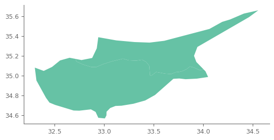
country_used = 'Cyprus'
domains_selected = [i for i in regions_gdf.names.values if country_used in i] # take all regions that contain the country of interest, in case NaturalEarth splits the country in more domains
regions_gdf.query('names in @domains_selected').plot()
<Axes: >
Get the boundary box. Because ERA5 Land has a resolution of 0.1 degrees, we will modify the boundaries so that they are increments of 0.1.
boundary_used = regions_gdf.query('names in @domains_selected').total_bounds
boundary_used # the values are given as minx, miny, maxx, maxy
array([32.30097656, 34.56958008, 34.55605469, 35.66206055])
minx, miny = np.floor(boundary_used[:2]*10)/10 # for min values we use floor
maxx, maxy = np.ceil(boundary_used[2:]*10)/10 # for max values we use ceil
Enter CDS API key
We will request data from the Climate Data Store (CDS) programmatically with the help of the CDS API. Let us make use of the option to manually set the CDS API credentials. First, you have to define two variables: URL and KEY which build together your CDS API key. The string of characters that make up your KEY include your personal User ID and CDS API key. To obtain these, first register or login to the CDS (http://cds.climate.copernicus.eu), then visit https://cds.climate.copernicus.eu/api-how-to and copy the string of characters listed after “key:”. Replace the ######### below with that string.
# CDS key
cds_url = 'https://cds.climate.copernicus.eu/api/v2'
cds_key = '########' # please add your key here the format should be as {uid}:{api-key}
In this tutorial we will work with temperature data from ERA5 land, that have finer resolution compared to ERA5.
c = cdsapi.Client(url=cds_url, key=cds_key)
c.retrieve(
'reanalysis-era5-land-monthly-means',
{
'area': [maxy, minx, miny, maxx], # North, West, South, East
'product_type': 'monthly_averaged_reanalysis',
'variable': '2m_temperature',
'year': list(range(1950, 2024)),
'month': [('0'+str(i))[-2:] for i in list(range(1, 13))], # the months should be given as 2 digit (e.g., '01', '12')
'time': '00:00',
'format': 'grib',
},
f'{dir_loc}/t2m_{country_used}.grib')
2023-08-01 21:16:37,361 INFO Welcome to the CDS
2023-08-01 21:16:37,361 INFO Sending request to https://cds.climate.copernicus.eu/api/v2/resources/reanalysis-era5-land-monthly-means
2023-08-01 21:16:37,696 INFO Request is completed
2023-08-01 21:16:37,697 INFO Downloading https://download-0008-clone.copernicus-climate.eu/cache-compute-0008/cache/data1/adaptor.mars.internal-1690750579.0248525-30650-12-5513b1c9-d723-4e6c-bdb3-e8a19500ea0f.grib to data//t2m_Cyprus.grib (310.1K)
2023-08-01 21:16:38,686 INFO Download rate 313.8K/s
Result(content_length=317520,content_type=application/x-grib,location=https://download-0008-clone.copernicus-climate.eu/cache-compute-0008/cache/data1/adaptor.mars.internal-1690750579.0248525-30650-12-5513b1c9-d723-4e6c-bdb3-e8a19500ea0f.grib)
Read the file.
t2m = xr.open_dataarray(f'{dir_loc}/t2m_{country_used}.grib', engine='cfgrib')
t2m
<xarray.DataArray 't2m' (time: 882, latitude: 13, longitude: 24)>
[275184 values with dtype=float32]
Coordinates:
number int64 ...
* time (time) datetime64[ns] 1950-01-01 1950-02-01 ... 2023-06-01
step timedelta64[ns] ...
surface float64 ...
* latitude (latitude) float64 35.7 35.6 35.5 35.4 ... 34.8 34.7 34.6 34.5
* longitude (longitude) float64 32.3 32.4 32.5 32.6 ... 34.3 34.4 34.5 34.6
valid_time (time) datetime64[ns] ...
Attributes: (12/30)
GRIB_paramId: 167
GRIB_dataType: fc
GRIB_numberOfPoints: 312
GRIB_typeOfLevel: surface
GRIB_stepUnits: 1
GRIB_stepType: avgid
... ...
GRIB_shortName: 2t
GRIB_totalNumber: 0
GRIB_units: K
long_name: 2 metre temperature
units: K
standard_name: unknown# "quick and dirty" plot of the data
t2m.isel(time=0).plot()
<matplotlib.collections.QuadMesh at 0x7f7703fa29e0>
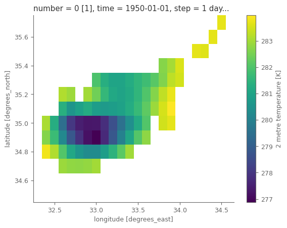
ERA5 Land has the finest resolution possible for a global reanalysis model, nevetheless we can notice that it cannot fully depict the spatial domain of the country.
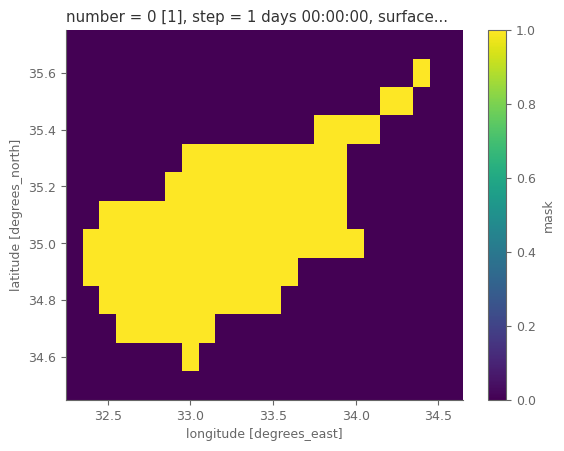
Let’s now use regionask for marking the temperature data so that only the grids over the selected country as used.
mask_countries = regionmask.defined_regions.natural_earth_v5_0_0.countries_50.mask_3D(t2m, lon_name='longitude', lat_name='latitude') # masks for the regions in the subdomain of the downloaded data
masks_selected = [i for i,j in enumerate(mask_countries.names.values) if country_used in j] # keep the masks only for the domains of interest
mask_country = mask_countries.isel(region=masks_selected).max('region') # in case the country is seperated in more regions, we combine the regions to one mask
mask_country = mask_country*1 # convert to 0-1 from boolean
mask_country.plot()
<matplotlib.collections.QuadMesh at 0x7f7702fe3250>
Section 3. Data analysis and plotting#
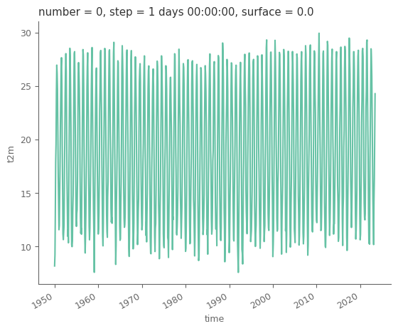
We will now use the country of interest for deriving the average temperature timeseries. The data are projected in lat/lon system. This system does not have equal areas for all grid cells, but as we move closer to the poles, the areas of the cells are reducing. These differences can be accounted when weighting the cells with the cosine of their latitude.
weights = np.cos(np.deg2rad(t2m.latitude)) # get weights based on latitude
average_t2m_country = t2m.weighted(mask_country * weights).mean(dim=("latitude", "longitude")) # weigthed average
average_t2m_country.to_dataset() # we use 'dataset' object instead of 'dataarray' so that the information are visually nicer
<xarray.Dataset>
Dimensions: (time: 882)
Coordinates:
number int64 0
* time (time) datetime64[ns] 1950-01-01 1950-02-01 ... 2023-06-01
step timedelta64[ns] 1 days
surface float64 0.0
valid_time (time) datetime64[ns] 1950-01-02 1950-02-02 ... 2023-06-02
Data variables:
t2m (time) float64 281.3 282.4 286.0 291.0 ... 289.5 293.1 297.4Let’s convert the temperature to Celsius from Kelvin, as the former is used more commonly.
average_t2m_country = average_t2m_country - 273.15
average_t2m_country.plot()
[<matplotlib.lines.Line2D at 0x7f7703e235e0>]
Now that we have the average temperature for the country of interest it’s time to generate the plots. But first let’s have the country name in ISO format, so that we can attach on the plot the country’s flag.
# get ISO names for the countries
iso_codes = pd.read_html("https://www.iban.com/country-codes")[0]
# just in case there are more than 1 regions for one country from regionmask, combine the shapefiles
country_final = regions_gdf.query('names in @domains_selected').drop(columns='abbrevs')
country_final['combo'] = 0
country_final = country_final.dissolve(by='combo')
country_final['names'] = country_used
# because names have differences, be more loose for preventing bugs (is not checked for all countries!)
iso_codes = iso_codes.iloc[iso_codes.Country.str.contains(country_used).values]
iso_codes['Country'] = country_used
country_final = country_final.merge(iso_codes, left_on='names', right_on='Country')
country_final
| geometry | names | Country | Alpha-2 code | Alpha-3 code | Numeric | |
|---|---|---|---|---|---|---|
| 0 | POLYGON ((34.02363 35.04556, 34.05020 34.98838... | Cyprus | Cyprus | CY | CYP | 196 |
Get the country’s flag. We will use png files available in country-flags repository.
iso_2digits_name = country_final['Alpha-2 code'].values[0].lower() # get the country's ISO 2-digit code and convert to lower
url_address = f'https://cdn.jsdelivr.net/gh/hampusborgos/country-flags@main/png1000px/{iso_2digits_name}.png'
img_data = requests.get(url_address).content
with open(f'{dir_loc}/flag_{country_used}.png', 'wb') as handler:
handler.write(img_data)
Now let’s create a plot using all yearly data for a specific month. We will give an option to create either a line plot with the actual values, or a bar plot with the anomalies.
def monthly_animation(month_of_interest, anomalies=False):
# Get the subset for only the selected month
final_timeseries = average_t2m_country.isel(time=(average_t2m_country.time.dt.strftime('%B')==month_of_interest)) # subset data
final_timeseries = final_timeseries.assign_coords({'time': final_timeseries.time.dt.strftime('%Y').astype(int)}) # rename time as year only
if anomalies:
final_timeseries = final_timeseries - final_timeseries.mean() # get anomalies
# use Red Blue colorbar
my_cmap = plt.get_cmap("RdBu_r")
rescale = lambda y: (y - np.min(final_timeseries.values)) / (np.max(final_timeseries.values) - np.min(final_timeseries.values))
# Let's calculate the linear trend in our data so we can add this information on the animation.
fit_line = final_timeseries.polyfit(dim='time', deg=1)['polyfit_coefficients'] # fit linear trend
linear_fit = fit_line[0]*final_timeseries.time + fit_line[1] # get fitted timeseries based on linear trend
# get min and max values for the y-axis
min_yaxis = np.floor(final_timeseries.min().values)
max_yaxis = np.ceil(final_timeseries.max().values)
# make the layout for the animation
fig = plt.figure(figsize=(11, 5), layout='constrained') # generate the figure
fig.patch.set_facecolor('.2') # change figure's background to black
gs = GridSpec(18, 20, figure=fig) # use GridSpec for non-regular subplots of the figure
bpax = plt.subplot(gs[3:, :17]) # create the axis for the basic plot
gmax = plt.subplot(gs[3:9, 17:20], # axis used for plotting the country on the global map
projection=ccrs.Orthographic(central_latitude=country_final.centroid.y.values[0],
central_longitude=country_final.centroid.x.values[0]))
cpax = plt.subplot(gs[9:15, 17:20]) # axis for adding the country's map
flax = plt.subplot(gs[16:, 17:20]) # axis for adding the country's flag
gmax.set_facecolor('grey') # change axis' background to black
gmax.add_geometries(country_final.geometry, crs=ccrs.PlateCarree(), edgecolor='red', facecolor='red', linewidth=2, zorder =20)
gmax.add_feature(cfeature.OCEAN, edgecolor='lightblue', lw=.5) # add the oceans as polygons from the cartopy library
gmax.add_feature(cfeature.BORDERS, edgecolor='0.1', lw=.1)
gmax.coastlines(edgecolor='0.1', lw=.3)
gmax.set_global()
txt_title_kws = dict(size=15, weight=500, ha='left', va='top', transform=bpax.transAxes) # arguments for text (as main title)
if anomalies:
year_title = bpax.text(.0, 1.3, f'2m temperature anomalies (\u2103), month: {month_of_interest}, country: {country_used}', **txt_title_kws)
else:
year_title = bpax.text(.0, 1.3, f'2m temperature (\u2103), month: {month_of_interest}, country: {country_used}', **txt_title_kws)
dates = final_timeseries.coords['time'].values # get dates
bpax.set_xlim(min(dates)-1, max(dates)+1) # specify the xlim of the plot (extend by 1 year both start/end)
bpax.set_xticks(dates[::4]) # add ticks every 4 years
bpax.set_ylim(min_yaxis, max_yaxis) # add limit of y-axis
bpax.set_facecolor('black') # change axis' background to black
sns.despine(ax=bpax, trim=True, offset=5) # trim the x and y lines
cpax.set_facecolor('black') # change axis' background to black
cpax.set_axis_off()
country_final.plot(ax=cpax)
country_flag = plt.imread(f'{dir_loc}flag_{country_used}.png', format='png')
flax.imshow(country_flag, aspect='equal')
flax.set_axis_off()
def update(frame, use_anomalies=False):
# for each frame, update the data stored on each artist.
# we plot 1 more frame for adding the trend at the end, so for last frame, use the year of the previous frame
if frame==final_timeseries.size:
current_year = final_timeseries.coords['time'][frame-1].item() # get current year
else:
current_year = final_timeseries.coords['time'][frame].item() # get current year
bpax.set_title(current_year, loc='left', pad=15) # add title of the axis plot
if use_anomalies:
bar = bpax.bar(final_timeseries.time[:frame], final_timeseries.values[:frame],
color=my_cmap(rescale(final_timeseries.values[:frame])), zorder=10) # colored scatter
# bpax.axhline(0, linestyle='--', color='white')
else:
line = bpax.plot(final_timeseries.time[:frame], final_timeseries.values[:frame], c='1', linestyle='--', zorder=1) # white dashed line
scat = bpax.scatter(final_timeseries.time[:frame], final_timeseries.values[:frame], c='.3', s=50, zorder=10)
# for the last frame add the linear trend
if frame==final_timeseries.size:
trend = bpax.plot(linear_fit.time, linear_fit.values, c='gold', linestyle='--', linewidth=3, zorder=20) # trend at the end of the animation
bpax.text(0.99, 0.05, f'Linear trend: {10*fit_line[0].values: 0.2f} \u2103/decade',
size=12, transform=bpax.transAxes, color='black', ha='right', zorder=20,
bbox=dict(facecolor='gold', edgecolor='black', pad=10.0)) # magnitude of linear trend
plt.close() # close the initial static plot as it is redundant
ani = FuncAnimation(fig, update, frames=final_timeseries.size+1, fargs=(anomalies,)) # Create the animation
return HTML(ani.to_jshtml()) # Display the animation in a Jupyter notebook
monthly_animation('June', False) # plot the line plot with the actual temperature values
monthly_animation('June', True) # plot the bar plot with the temperature anomalies
The final plot will be an interactive plot. For that we will use pandas dataframes. We will create one with all values in one timeseries with additional columns with useful features. We will also create one more dataframe which is a pivot version of the first dataframe, with each year being a different columns. This latter dataframe will only have the temperature timeseries and no additional information.
data_df = average_t2m_country.to_dataframe().drop(columns=['step', 'number', 'surface', 'valid_time'])
data_df['month'] = data_df.index.month
data_df['year'] = data_df.index.year
data_df['date'] = data_df.index
data_df['color'] = 'year'
pivot_data_df = data_df.pivot_table(index='month', columns='year', values='t2m')
Order the years based on the average order of their values for all the months. In this way, the first year will be the year that on average has the smallest values for the 12 months from all years.
pivot_data_df_colors = pivot_data_df.copy(deep=True).dropna(axis=1) # use only the years that have values for all months
years_values_ordered = pivot_data_df_colors.apply(lambda x: np.argsort(x.argsort()), axis=1).mean(axis=0) # average order of the years
Let’s color the lines based on their “temperature order”, giving stronger colors for the years that have in general higher temperatures for the different months.
# get colors used for the data. Use Green colorbar, and allocate the colors after sorting the values
years_values_ordered = np.argsort(np.argsort(years_values_ordered.values)) # extract the order of the values for being sorted
cmap_colors = sns.color_palette("Greens", as_cmap=False, n_colors=len(years_values_ordered)) # get number of colors as the number of years
cmap_colors = np.array(cmap_colors)[years_values_ordered] # order the colors so they align with the sorted values
# plotly needs colors either from a predefined list or in specific RBG format. Let's use the RGB format since the former is not possible in our case
cmap_colors = (cmap_colors*255).astype(int) # convert to 0-255 RGB
cmap_colors = [f'rgb({i[0]}, {i[1]}, {i[2]})' for i in cmap_colors] # convert to string format
# create a Series for adding a fixed color (gold) for the years that had missing values (e.g. the current year)
cmap_colors = pd.Series(cmap_colors, index=pivot_data_df_colors.columns) # create the series
cmap_colors = cmap_colors.reindex(pivot_data_df.columns).fillna('gold') # expand the series with all years and fill color
cmap_colors = cmap_colors.values # get the RGB values of all the colors
# plot all data as gray thin lines
fig = px.line(data_df, x='month', y='t2m', color='year', markers=True, title=f'2m temperature (\u2103), country: {country_used}')
fig.update_traces(line_color='grey', line_width=.5)
# make a slider so the user can select any of the available years, which is highlighted with a thick line, colored based on the temperature order
# Add traces, one for each slider step
for i_col, col in enumerate(pivot_data_df.columns):
fig.add_trace(
go.Scatter(
visible=False,
line=dict(color=cmap_colors[i_col], width=6),
name=col,
x=pivot_data_df.index,
y=pivot_data_df[col],))
# Make the first year from the go.Scatter visible
fig.data[pivot_data_df.shape[1]].visible = True
# Create and add slider
steps = []
for i in range(pivot_data_df.shape[1]): # len is half, since each year is plotted twice (in px.line and go.Scatter)
step = dict(
method="update",
args=[{"visible": [True] * pivot_data_df.shape[1] + [False] * pivot_data_df.shape[1]}], # px.lines always visible, and go.Scatter not visible
label=str(pivot_data_df.columns[i])
)
step["args"][0]["visible"][pivot_data_df.shape[1]+i] = True # make the go.Scatter of the selected year visible
steps.append(step)
sliders = [dict(
active=0,
currentvalue={"prefix": "Year: "},
pad={"t": 50},
steps=steps
)]
fig.update_layout(
xaxis=dict(showline=True,
showgrid=False,
showticklabels=True,
title='',
linewidth=2,
ticks='outside',
tickvals = list(range(1, 13)),
ticktext = ['Jan', 'Feb', 'Mar', 'Apr', 'May', 'Jun', 'Jul', 'Aug', 'Sep', 'Oct', 'Nov', 'Dec']),
yaxis=dict(showgrid=False, title=''),
showlegend=False,
plot_bgcolor='black',
sliders=sliders
)
plt.close() # don't show the figure here, because it is shown in the next cell
NOTE:
For being able to view the interactive plot in your jupyter notebook, you need to activate the command fig.show(). The remaining 3 lines are needed for being able to show this plot in the jupyterbook.
# fig.show() # this is needed for viewing the plot in the notebook
# These three lines are needed for creating a figure that can be compiled when generating the jupyterbook, so it's visible in the webpage.
plot(fig, filename = 'figure_interactive.html', config={'showLink': False, 'displayModeBar': False})
init_notebook_mode(connected=True)
display(HTML('figure_interactive.html'))